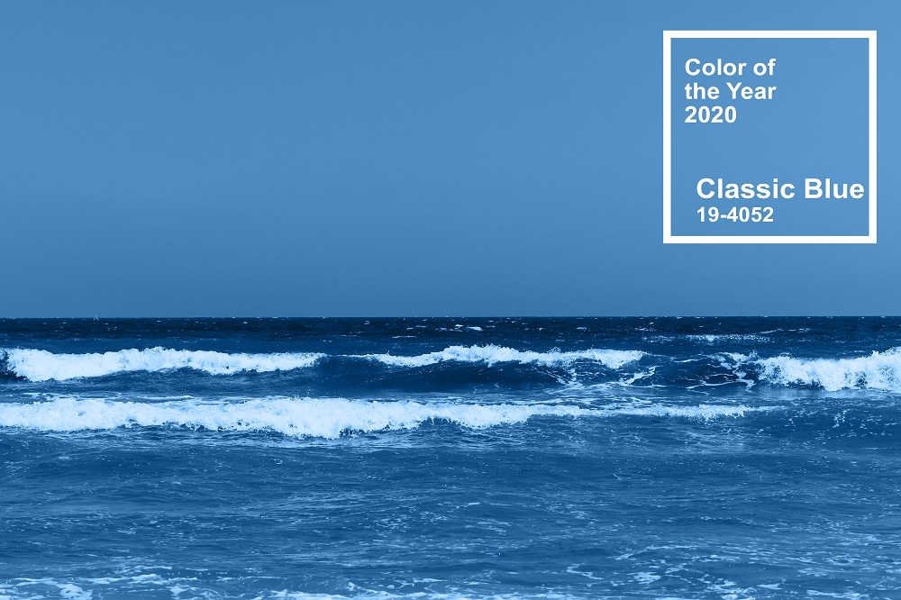
While last year's colour Living Coral was an "animating and life-affirming" choice, 2020's shade "brings a sense of peace and tranquillity to the human spirit, offering refuge," according to the company. Regardless as to whether you agree with the company, the announcement has become an established tradition that is greeted by much analysis and comment from trend setters across a wide range of industries, from graphic design, film and fashion to interior design and events.
Blue is the colour
Blue is one of the three primary colours used as pigments for painting and traditional colour theory. This makes it an important colour in both art and decoration. Blue is mixed with other colours to make different hews and shades. Green is added to make azure, aquamarine is the result of the addition of violet. It is a cool colour that has a calming effect on the psyche and is said to display creativity and intelligence while symbolising loyalty, strength, wisdom and trust. It is a colour that is popular in business, law enforcement and medicine as it radiates security, trust and responsibility. It is plentiful in nature, often used to represent water, and the ocean and the sky.
Our Colour Collection
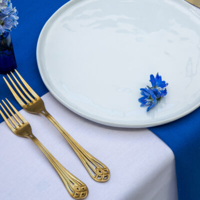
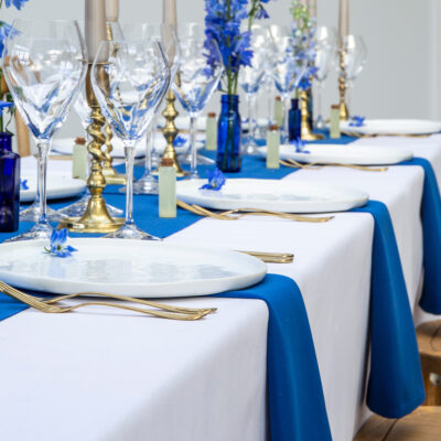
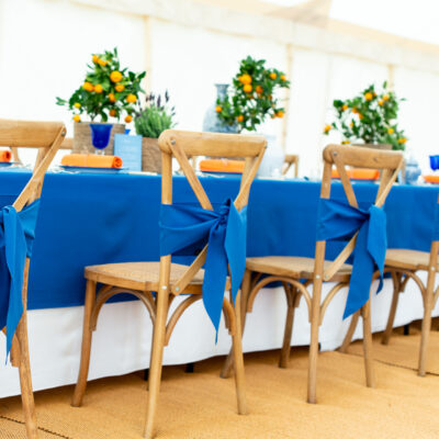
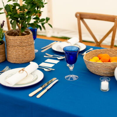
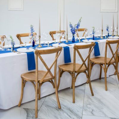
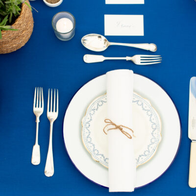
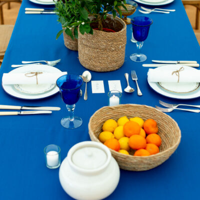
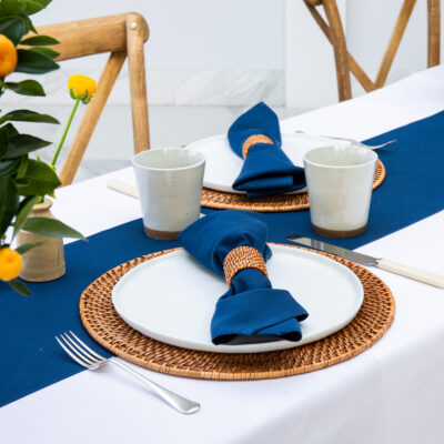
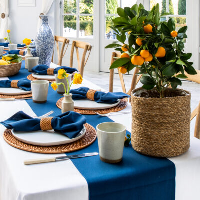
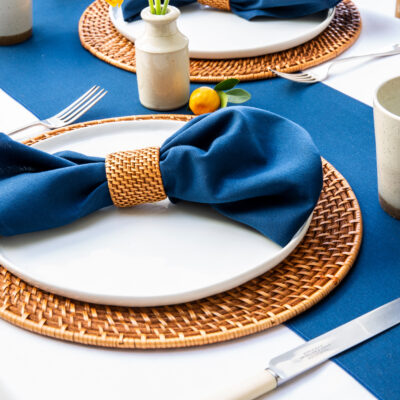
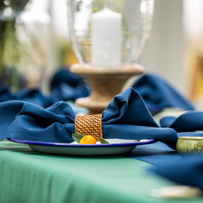
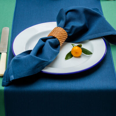
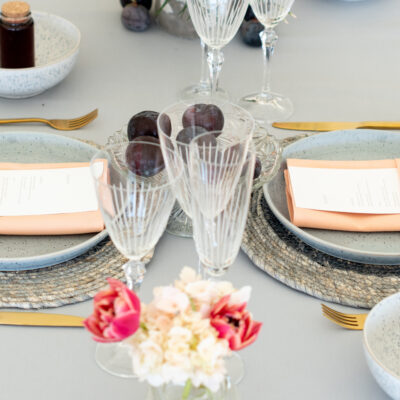
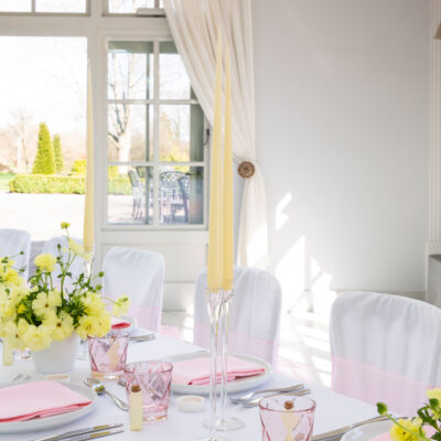
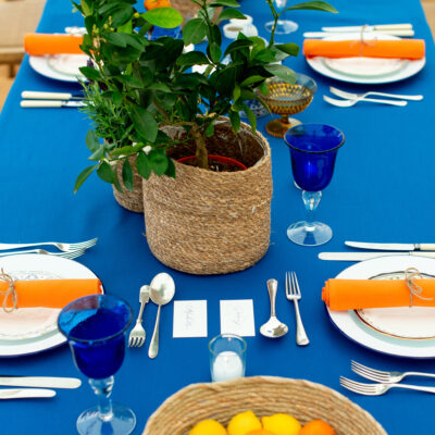
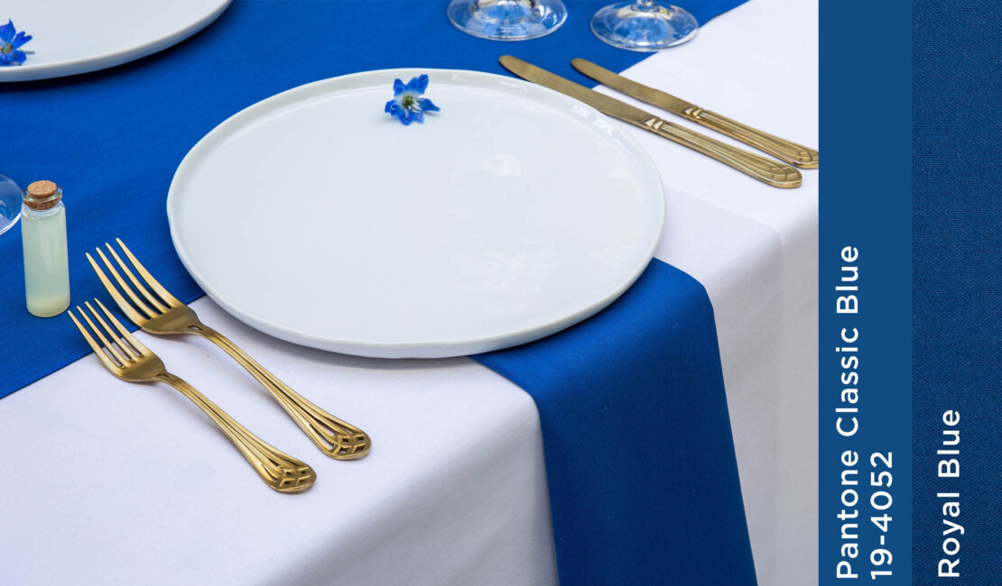
Classic Blue is at the centre of the blue spectrum, and therefore it is considered a friendly, calming colour. This makes it perfect for events where you want your guests to feel relaxed and confident. Our own Royal Blue is a very close match to Classic Blue. It is a deeply pigmented blue that provides a regal and striking backdrop whereas if you are looking for something a shade darker Oxford Blue is brighter than a standard navy and this charismatic blue is both smart and warm.
Take inspiration from previous Pantone Colours of the Year
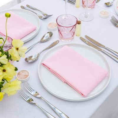
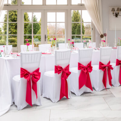
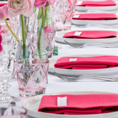
The aforementioned peachy shade Living Coral, chosen by Pantone as its colour of the year 2019, is ideal for forming the basis of a wedding theme or even as the backdrop for a more flamboyant event. In fact, we don’t believe it was any coincidence that the Met Gala chose a similar theme for the table linens; an event that is famed for its exuberance and a guest list that includes celebrity stars, young creatives, and industry paragons alike. Special Occasion Linen customers can achieve a similar look with either our Coral or Blossom Pink napkins and table cloths.
A zesty shade of green called Greenery was selected in 2017, which is not dissimilar to our own Mint Green colour allowing you to bring a zingy bright natural hew to any event. While in 2016 Pantone picked two soft colours –Serenity, a baby blue that can be compared to our own Cambridge Blue, and Rose Quartz .
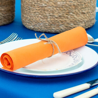
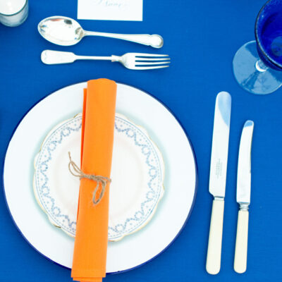
Other annual colours include the purply pink Radiant Orchid that is similar to Pink Fushia announced for 2014. While the bright orange Tangerine Tango in 2012 is akin to our own Mandarin Orange.
Whether you want to capture the essence of spring or are looking ahead to great summer trends, our Lookbook will help you create an unforgettable event. Check out our Pinterest for inspiration and the latest trends. We know you will have many more creative ideas, so tag @special_occasion_linen on Instagram using #SpecialOccasionLinen to show us your event table settings and tablescapes.